Ole 60 Logo: The Complete Guide Overview
The Ole 60 logo is two things, and most people only notice one of them.
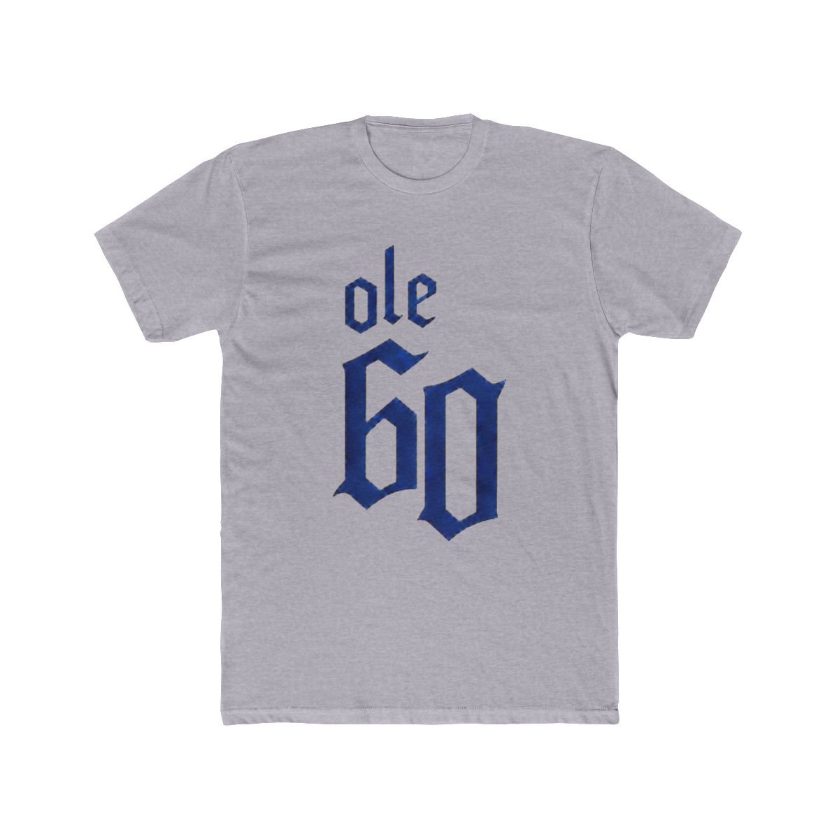
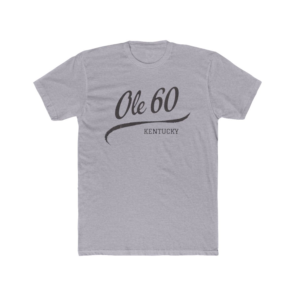
The first is the wordmark: the band's name set in plain, spaced-out type. No crest, no mascot, no ornate monogram. It reads like something stenciled on the door of a work truck more than something drawn up in a design studio.
The second is the truck. It rides alongside the name rather than inside it, and the clearest example is the 2025 Tour Orange Hoodie | Ole 60, where "Ole 60 2025 Tour" is printed across the front and a pickup fills the back panel. Two-sided, two ideas, one piece of clothing.
If you've only seen the name on a shirt, you've seen half the mark.
Search behavior backs that up. Interest in this mark tilts hard in two directions: people trying to identify a shirt they saw at a show, and people deciding whether a listing they found online is legit. Both questions get easier once you know what the logo is supposed to look like - and with cooler months arriving, the hoodie version is the one people are hunting for again.
The Wordmark
Two words and a number is a hard logo to build. "Ole 60" has to survive being shrunk to a thumbnail and stretched across a hoodie chest, and it has to manage that without any graphic help.
The answer is spacing. The letters sit loose, and the "60" gets its own air so the number doesn't get crushed against the "Ole." That's why you almost never see the mark small on merch. It wants a full chest panel or nothing at all.
Just as telling is what isn't there. No circle, no banner, no ribbon, no state outline. Typography does the entire job, which is a deliberate choice for a band whose appeal rests on not being over-produced.
The Truck
The truck is where the personality goes.
Ole 60 came up in Kentucky and broke out nationally on "Smoke & A Light," the song that turned regional bar-room shows into something much bigger. A pickup on the back of a hoodie is that same story in picture form: dirt roads, long drives, a small town you can't quite leave.
It's also why the two-sided pieces work. The front carries the name so anyone can read it. The back carries the truck so the people who already know nod back.
The Colors
Orange does the heavy lifting. It's the loudest color in the run, which is why it landed on the tour hoodie instead of something safer.
The 2025 White Tour Tee | Ole 60 goes the other direction: white base, print forward, nothing shouting. Same logo language, lower volume. Having both in the same drop is the point - you pick your setting.